

Estimating the Actual Race Pace of the Formula 1 Teams
Analyzing how Formula 1 teams have progressed or regressed during the 2025 season


During the past couple of seasons, Formula 1 broadcasts have shown graphics with the pace gained or lost by teams during the season. These are estimates since the pace of the cars aren't compared in a controlled setting. My goal is to create a similar product tracking the pace of teams over the course of a season.
Challenges
There are lots of reasons why it's quite difficult to determine the true pace of a car and how it compares to other cars in the field:
Each circuit has different characteristics, and lap times are affected by how well a team's car is suited to the characteristics of the individual circuits. The setup of a car also matters, including things like the ride height and adjusting the wings.
Drivers have a big impact, and this is evident when one driver consistently outperforms the other driver on the same team.
Lap times are affected by whether or not a driver is pushing to produce the fastest lap times or are conserving tires.
Teams often use different tire strategies during races. Harder tire compounds have less grip and initially produce slower lap times, but they also last longer and generally outperform softer tires at the end of a stint.
The weight of a team's car also affects lap times, and cars go faster with less fuel. During the course of a race, fuel is consumed, and lap times will generally increase if all else is equal.
Teams also use different engine modes, and this affects the pace of a car.
Other traffic on the circuit can impede a car and cause lap times to be slower.
Even without the ability to do a truly controlled test, it’s possible to account for some of these factors. Averaging the pace of a car across several different circuits limits how much the results are skewed by a car performing particularly well or poorly at one circuit. If enough laps are used in the average, it will hopefully include periods both where the driver is pushing and also when they're conserving tires. Laps that are deleted due to exceeding track limits, pit entry and exit laps, and laps where a car is close behind another car can be excluded from the average.
Tire Performance and Fuel Load
Direct measurements of the fuel remaining in a car aren't available. However, there's no refueling in F1, so I can use the lap number as an approximate proxy for fuel load. There aren't direct measurements of tire wear, either, but I can use the tire compound and the number of laps run on a tire to have some idea about tire wear. I've used a similar approach to the ideas in a thread on Autosport's forums, applying multiple linear regression to estimate an expected lap time based on the fuel load and the tire compound.
Tire performance definitely isn't linear, but I’ve noticed that in most cases, a linear fit doesn’t seem to perform much differently than a couple of other simple options. For example, there’s usually little difference between a simple linear regression and adding in a higher order quadratic term for the age of the tire. The one exception I’ve noticed is when wet weather tires are used, where it appears that the addition of a quadratic term can significantly improve the fit. I suspect that this may better account for changing track conditions. From my testing, including the higher order term doesn't make a large difference in the overall results, but there is a difference. Because it does improve the quality of fitting the data for wet weather conditions and seems to have little impact for dry weather conditions, I’ve left it in the analysis.
The regression equation provides a baseline for how a car is expected to perform based on the tire compound, number of laps on the tire, and the race lap number. Subtracting that number from the actual lap time gives me an estimate of whether the car is performing better or worse than what would be expected under those conditions. These calculations are done for each tire compound at each race.
There is one situation where I suspect that including specific data might produce poor results. If there aren't enough teams that ran a significant number of laps on a particular tire compound, I don't trust that the baseline will be reliable. For example, if only a couple of teams did any race laps on a particular tire, and those teams are backmarkers, it would make the performance of those teams appear better on that tire than it really was. My solution is that I just don't include data from that particular race and tire compound in my analysis.
Making sense of the graphics
F1's actual team pace graphic is a bit ambiguous because it shows pace gained or lost in seconds. The problem is that this depends on the circuit, and the gaps are probably going to be smaller at a short and fast circuit like Budapest than at a much larger circuit with some slow sections like Baku. The race lap record at Baku is 103.009 seconds whereas it's 76.627 seconds at Budapest. I'd like to produce a graphic that's less ambiguous, where the times are relative to a reference circuit with a defined reference lap time.
I estimate an typical lap at the circuit as an average of the lap times at each race for all teams and tire compounds. This average leaves out pit laps, laps deleted for exceeding track limits, and laps where a car is running closely behind another car for position. Then I scale the lap times up or down to estimate how well teams would perform if a typical lap at the circuit took 100 seconds. This then allows the lap times to be averaged between different circuits with varying lengths and characteristics.
Also, there's not a good way of knowing how much an individual F1 team has improved or regressed during the season. If F1 visited the same circuits more than one during the season, it might be possible to estimate how each team's absolute pace has changed during the season. In the absence of that data, these graphics instead show how the pace of F1 teams has evolved relative to each other during the season.
Source code and data access
My projects usually rely heavily on free and open source software like Linux, Python, and many Python libraries. I've noticed that many tools used for analyzing data in sports and making predictions are closed source and proprietary. Some of their results are released publicly, but the tools are never made available to the public. The data is shared with the public, but the accumulated knowledge of how to work with the data sets and draw useful conclusions from them isn't shared.
My background is in academia, where researchers are encouraged to freely share data and software tools with the academic community and the public. I believe that we all benefit when software, data, and knowledge are disseminated as widely as possible. For that reason, I've released my source code for this analysis under an open source license and posted it in a Github repository. I fully intend to release my source code and keep it free, both for this and future projects.
As a reminder, it's not free for me to build software tools, write this content, and host it online. I do have very real expenses, and your contributions will help me be able to continue making additional content freely available. Over the past couple of years, I've created a lot of software tools for working with sports and scientific data, and I'd like to share that knowledge. Please contribute to me as you are able so that I can continue doing this. I assure you that everything I write is my own work, and I never use artificial intelligence to create any of the content I'm sharing with you. If you'd like to contribute, please see my about page for ways to help me financially. Generosity at any level is greatly appreciated.
The specific tools for this project are part of a software package I've codenamed Maranello. That is the name of the city in northern Italy where Ferrari is located. I have a few more source code files to add to the repository in the next few days for some other analysis, but the files I'm using for this are f1_team_pace.py to analyze the pace of cars in each race, and pace_postprocess.py to aggregate the data across multiple races and generate graphics. There's a README that explains the parameters for each program. It's not necessary to manually download any data because f1_team_pace.py uses the FastF1 library to do that automatically.
2025 F1 team pace
Here's a graphic showing the estimated pace of the teams during the first ten rounds of the 2025 F1 season:

The lines show the estimated race pace for each team on a circuit that would be 100 seconds for an average F1 car. Teams at the top would be faster than 100 seconds whereas teams toward the bottom of the graphic would be slower. Because this is just an estimate of a team's true race pace from sampling many laps, there is some uncertainty, and the team's race pace could be a bit higher or lower. The shading around the lines is an 80% confidence interval, meaning that there's an 80% probability that the team's actual race pace is within that shading. The legend shows the ordering of the teams from fastest to slowest at the most recent week of the season.
There's a clear gap between the four teams at the top and six teams at the bottom, and this gap seems to have widened a bit during the course of the season. I'm not surprised by this because 2025 is the final year of the turbo-hybrid era, and a lot of the teams farther back in the field are probably dedicating nearly all of their resources to developing a new car for 2026. It's a bit more surprising to see Ferrari clearly in second place, though well behind McLaren. From watching the races so far in 2025, it's seemed like Ferrari has struggled quite a bit and haven't been able to separate themselves from Mercedes or Max Verstappen's Red Bull car. Further analysis would be required, but my suspicion is that Ferrari's strategy decisions haven't allowed them to use the true pace of their car as often as their competitors.
Analysis of prior seasons
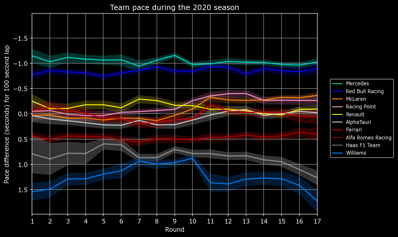
I've also done the same analysis going back to the 2019 season.


My software will actually run for the 2018 season, too, but I suspect there are some data quality issues, and the graphic for that season doesn't look correct to me. I'd also want to modify the code to explicitly tell it that Force India and Racing Point are treated as two distinct entries in the F1 championship, but they were effectively the same team. It's also very clear to me that the F1 grid was much more colorful in previous seasons, making it much easier to distinguish the teams from each other. In 2025, there are a lot of teams that are blue or green and that have very similar colors.
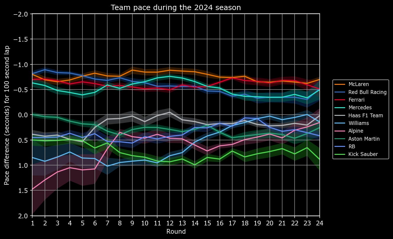
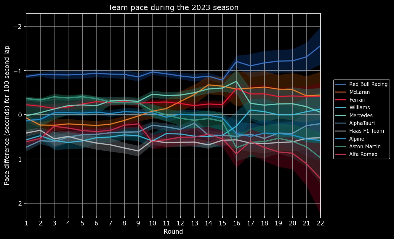
Beyond that, perhaps the most intriguing thing to me is the 2023 season. Red Bull was absolutely dominant, though not quite to the extent as Mercedes was at the start of the turbo-hybrid era. But even though the two Red Bulls could drive off into the distance, the rest of the field was actually rather competitive on race pace. At least through 10 rounds of the 2025 season, McLaren is clearly the best team in the field, but they don't appear nearly as dominant as Red Bull was in the 2023 season. That could still change toward the end of the season if Red Bull, Mercedes, and Ferrari stop working on upgrades to their 2025 car and also focus entirely on 2026. It's also notable just how short-lived Red Bull's 2023 dominance really was. By 2024, the top four teams in the field had become much very competitive once again.
Conclusion
This analysis isn’t perfect, and there are a number of things that I considered doing differently. One possibility is trying to also discard laps where cars were lapping other cars and could impede progress that way. I also considered the possibility of trying to account for the differences between a team’s drivers and only using data from the faster car during a race. An example of that is Red Bull, where Verstappen is competitive with the best drivers in the field, but the second Red Bull car has been a revolving door of different drivers who haven’t unlocked the performance of that car. The problem is that the scenario may also reflect that the Red Bull car is very hard to drive, and that it takes an exceptional talent like Verstappen to be competitive with the top of the F1 grid. Is that really a good car, or is it just an exceptional driver compensating for the shortcomings of the Red Bull? It’s simpler to include laps from both drivers on a team and not try to make that determination, and I also believe it more accurately reflects the quality of the Red Bull car.
While there certainly are refinements that could be made to this approach, I also believe that it’s a good start toward estimating the true race pace of each team’s cars on the F1 grid. I didn’t end up replicating the graphic that F1 shows on their broadcasts, but it still contains the same information about how teams have progressed relative to each other over the course of a season. Even if this season’s outcome is rather predictable because it’s the end of the turbo-hybrid era, I look forward to seeing how teams progress with the new sporting regulations in 2026.